

Desktop app

2019
A new dashboard for Coronet SecureCloud, a web application for protecting company data located
in cloud services
Coronet SecureCloud | UX/UI design team member
The problem

The shift from corporate to a predominantly SMB market necessitated an updated design for the Coronet SecureCloud web app's dashboard in order to meet the demands of a new target audience. The dashboard is a key component of our system and as such needs to be able to provide all crucial information to the user in an efficient and friendly way, regardless of their level of expertise. In addition, a well-designed dashboard is also required to provide the best support for successful sales operations, particularly during the live demo and initial trial stages of the customer's journey.
Keep up or stay behind, companies need to constantly adjust their products and their designs to be able to meet the demands of changing markets and target users, and so increase the scope of their sales.
Competitive research
After reviewing several other dashboards of similar web security products, we realized that most of them provided an analytical type of dashboard, which usually calls for a security expert to make sense of the data. In addition, since we are the only product in the market that covers so many areas of digital security we were facing a particular challenge regarding which data should be represented and how. In order to adjust our dashboard to our comprehensive security approach, while staying accessible to our users, we needed to revisit the characteristics of our average user.


User research
We talked to our users so that we could better understand their requirements from the updated design. They emphasized the significance of a dashboard as a user conversion tool. In particular, we understood that a well-thought-of dashboard greatly affects the way in which customers perceive the entire system, during the initial product demo and trial period. Additionally, users pointed out to several KPIs that should be represented
in the new dashboard:


The level of security coverage for each service.

The number of monitored and unmonitored employees.

Level of access control.

The number of security events and their trends.

Number of monitored activities and scanned documents.
The solution

We decided that instead of an analytical dashboard, laden with incomprehensible data, we would develop a different kind of dashboard, an operational one. The new operational dashboard will provide the user with a clear indication of which actions they need to take and when, and will:

Facilitate decision making by displaying the system's main KPIs in a clear and accessible manner.

Support an easy-to-use language and terminology that can be understood by the average IT manager.

Enhance sales efforts by providing an enticing design that is apparent immediately during a live demo.
The value
Users can access data and manage a complex cybersecurity system with ease.
The goal
To provide users with an operational dashboard, which supports better decision making.
Target audience
Examining user personas with our marketing team, we redefined our target audience to include users who do not necessarily have comprehensive knowledge of all cyber security aspects, and that also do not have the time to become experts on the matter. This means that particular efforts need to be invested in making the design of the dashboard as clear, user-friendly, and data-accessible as possible, even for non-experts.

Design directions
The design

After characterizing the requirements of our new target audience, we understood what we had to do – to provide a design that is able to convey all the necessary data in a user-friendly, accessible manner, in terms of both appearance and language.
We explored and tested various design frameworks, to see which best answers our conceptual demands for clarity and accessibility of information. The design concept as a whole and each design element were guided by questions such as: How does it help the user? Is it effective enough? Does it present all the necessary information? Is it clear enough?

Final design
Our final design is a result of much research and deliberation. We knew we wanted a clean and readable dashboard with clear operational hierarchies that fit the user's needs. After trying different elements in different arrangements we felt that we struck the right balance between the data we needed to present and the level of simplicity we wanted to maintain.

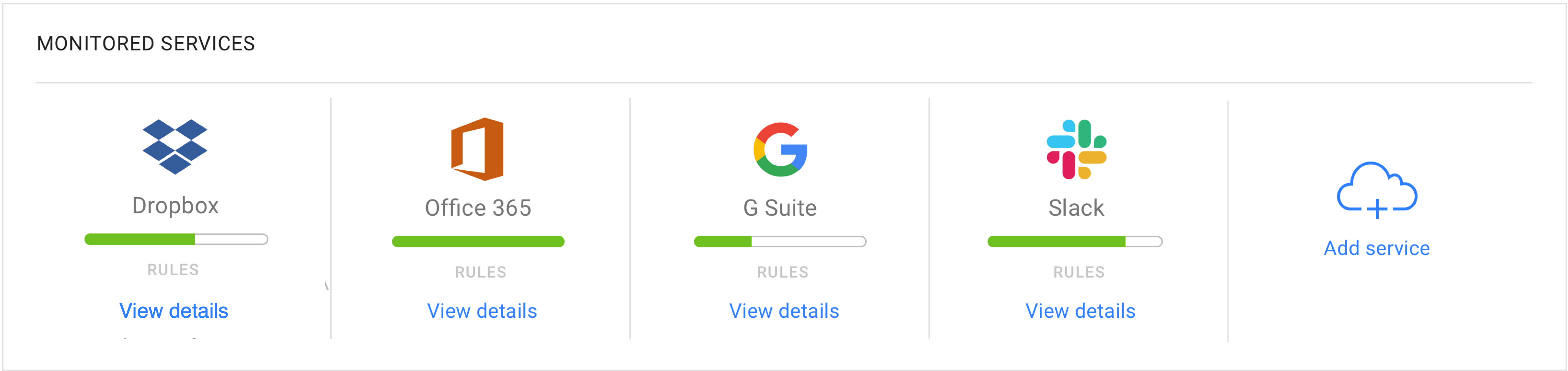
Service protection module
The main purpose of Coronet's system is to protect the data stored in different cloud services. For this reason, we gave service protection a prominent representation on our new dashboard. We also added a constant CTA encouraging the user to add additional services. In line with our simplicity principle, we decided to display the protection coverage in an approachable way, pushing more detailed information to the second level.
To keep the dashboard as simple as possible, secondary information is hidden from the user's immediate view, and is revealed only upon a specific request from them.

Supporting sales efforts
It is difficult to demonstrate the benefit of a security system, when there are no active security threats. We therefore decided to add activity counters at the top of the dashboard. Once services are connected, the counters start running. These give an indication to the user of the system's functionality and ongoing protection activities. In this way, sales representatives can immediately refer potential customers to the apparent added value of our security system.

Empty states
The dashboard functions as a landing page as well to which the user is redirected after signing up for the first time. At this stage, the system is not configured yet and there is no data to display. In order to encourage the user to take the first step in configurating the system we designed an empty state with CTA buttons, relevant to specific modules.
