
Mobile app


2019-2020
Dine In is a food delivery & takeaway service that brings the full restaurant dining experience straight to your doorstep.
Individual project | UX, UI, Interaction design
The problem

Online food delivery options are on the rise, becoming more and more popular among city dwellers. However, at the same time, people are feeling that they’re missing out on the dining experience and what it entails, namely service. There is no interaction, no one to turn to, for example, with questions and concerns about the dishes.
No friendly face remembering exactly how you eat your steak. The need for adapting to the personal needs and preferences of users is more than just a trend, it’s a real issue and one that should be resolved. In particular, enhance their experiences of online services,
such as food delivery.

Users can't always know exactly where their delivery is
%202.png)
There is no human response to your concerns and queries

Search and filtering options are not necessarily user friendly
Despite the huge potential of the food-delivery market, probably less people than there could be are engaged with these delivery apps.
Competitive research
I reviewed similar food-delivery applications on the market in order to assess how they deal with the problem that I have characterized.


Strong suit:
Offer both delivery and pick-up options
Options are detailed and rated, making it easier to choose
Search is made easier with categories
Personal and payment details are saved for future use
Pain points:
Contacting the courier is not always an option
No tracking delivery time
Hard to customize and change ingredients of dishes
Filtering and sorting options are limited and not necessarily relevant to what the user needs
User research
I wanted to understand from the users themselves what their expectations and requirements from a food-delivery application are. I targeted people who lead a busy lifestyle that results in them ordering-in quite often, predominantly online.


Conclusions from the interviews
To conclude, users emphasized their need to feel in control when using any online food-delivery service. According to users, specific features should include:

Believe the app should remember them and their preferences

Want a convenient way to contact the courier or restaurant

Prefer not to be shown places that do not deliver to their location

Struggle to sort the options according to their preferences
The solution
The design of my app addresses the need of the user to feel in control and receive personal service, to feel that their needs are understood. Users should enjoy an effortless experience when ordering their meal.

%20Copy.png)
Target audience
Typical early to mid-30s, financially settled, Generation Y users that enjoy a fast-paced and indulgent lifestyle.

The value
Save time and effort searching
for and ordering your favorite dish and enjoy an in-control feeling throughout.

The goal
To reduce user friction, decrease app abandonment and increase onboarding among users.
The product

Sitemap
I began the design process by first creating a sitemap with all the application pages,
helping me to thoughtfully construct the application and its features.

Wireframes - Concept
The next stage was to put together and examine low fidelity wireframes.
I tried different layouts, exploring ways of making the experience intuitive and clear. For example, the gallery of cuisine/restaurants, in which the user is exposed to all available options.

I tried to sort the options in different ways. After testing several concepts I chose to proceed with the option that displays the most cuisines in one page, without showing the restaurants themselves, in order to make the decision-making process as easy as possible for the user.
Wireframes - User flow
After ideating the concept, I focused on the main user flow.
I laid out all of the pages so I could visualize how each piece related to one another and the steps a user will take to order a delivery.

The design
When I designed the product's interface I envisioned the effortless experience that the user needs and deserves. I chose a clean design, with a relatively minimal palette, in order to emphasize the colorful photos of food. I chose a design that radiates fun, easiness and playfulness, which sustains an enjoyable experience of food and eating.


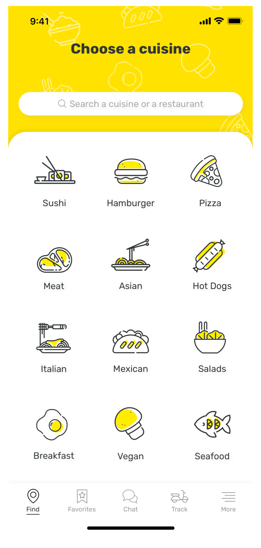
An approachable cuisine gallery
In order to provide the user with a readable interface, which is not overcrowded with imagery, I chose illustrated icons to depict the various cuisine types. Moreover, I chose to incorporate yellow in my design, due to its emotional association with optimism and fun, and since it is generally not overused in food app design.


Scannable search results
Search results are filtered and organized in a user-friendly way.
Users can sort search results based on criteria such as price, distance, delivery time and rating.
The results' page is designed in an easy-to-scan way, thus helping users reach a decision regarding their preferred option quickly and efficiently.

Easy tracking
From the moment of ordering, the user is informed in real-time of the status and location of their order. The ETA is given in resolution of minutes and is constantly updated.
In addition to location services, users can easily contact the courier via the app or by phone. Users can also contact the restaurant when and if they need to. An interactive map shows the location of the courier, keeping the user updated and in-control at all times.
