
Wix Dealer
DESKTOP APP | INTERNAL
BACKGROUND
2020-2021 | PRODUCT DESIGNER
Wixs’ Funnel company is a cross-functional team focused on optimizing the user journey from signup to subscription - by segmenting users and exposing them to the most relevant Wix solutions. The team drives activation, conversion, and engagement through data-driven experiments and personalized user experiences.
The Dealer is an internal targeting engine, enabling product and marketing managers to improve engagement by personalizing the end-user’s journey.
THE PROBLEM
Helping users navigate the noise
Wix constantly develops new products and features to improve user engagement and overall usability. With so many options to choose from, users may lose their way in the clutter, as different features are designed for different use cases.


How then can the right features be targeted and offered to the right users?

The Dealer is an internal Wix platform used by the company’s product and marketing managers to create a personalized engagement funnel for each end-user. The platform offers its users advanced segmentation and tracking features, ensuring that Wix end-users are exposed to the features that best suit their particular needs.
And this is how Wix end-users experience the Dealer’s “offerings” - targeted features to answer their needs

FOR EXAMPPLE:
Wix Business Manager
A view on Wix’s signature back office interface

Dealer based placements
Personalized content, segmented by the Dealer
Old Dealer back office
The old Dealer was created to answer an immediate need that changed over time while expanding the platform’s userbase. The development process was rather “on-the-go” and didn’t take into account a full user experience that could appeal to a wider set of users and needs.


OUR CHALLANGE
Designing for the designers of the journey
To truly help end-users navigate Wix’s growing ecosystem, we first needed to improve the tool used to shape their journey. Our challenge was to enhance The Dealer itself - making it more intuitive, efficient, and accessible for product and marketing teams who rely on it to build personalized user experiences at scale.
RESEARCH METHODOLOGY
Learning from the ecosystem
To better understand how to improve The Dealer, I explored how internal users interact with the platform and how similar challenges are solved across the marketing and product landscape. The goal was to identify gaps, uncover unmet needs, and gather inspiration for a more intuitive, scalable experience.
Interviewed 20+ internal stakeholders (Ops, PMs, PMMs) to identify pain points, usage patterns, and unmet needs within The Dealer
Spoke with ~20 Wix users to uncover what messages they receive, where they see them, and how they respond
Audited existing communication flows - including message placements, targeting strategies, and offer logic
Researched and drew inspiration from leading tools like Google Ads, Facebook Ads, Dynamic Yield, and Intercom
USER RESEARCH
When the core audience doesn’t engage
Although PMMs constitute the largest part of the Dealer’s user-bases, and although the platform was initially created to meet their needs, they are hardly engaging with it. This rather defeats the purpose of the platform in the first place.
For these reasons, we decided to focus most of our research efforts on this particular group.

Operations
Product Managers
Product Marketing Managers
PMMs can be further divided into three subgroups, covering different areas of responsibility:
Placement Managers
Manage & prioritize all messages within a specific placement
Product Marketers
Promote new features and products
Audience Managers
Manage all messages that target a specific audience
CONCLUSIONS
What was missing
Key information is hard to find or scattered across the platform
Users lack a clear, integrated view of the full product — the "big picture" is missing
Heavy reliance on other roles (analysts, ops, designers) creates friction and delays
Placement options and feature capabilities are unclear or poorly understood
The product feels unapproachable: user flows are disjointed and the copy is overly technical
THE SOLUTION
Redesigning the Dealer around how people work
We redesigned The Dealer to reflect how users actually think and work. Instead of forcing a one-size-fits-all workflow, the new system offers three distinct perspectives, allowing PMMs to plan, prioritize, and take action based on their specific goals and intent.
Each offering is now tied to one of three core dimensions:
Placements
Prioritizing what users see, where, and when across products and audiences
Audiences
Optimizing communication touchpoints throughout the user journey
Campaigns
Aligning product promotion with team goals and measurable outcomes

UX APPROACH
Clarity and consistency first
Our user research didn’t just inspire the redesign — it defined its foundation. We translated recurring pain points and needs into a set of UX guidelines that shaped every design decision moving forward.
Key principles included:
Clear, intuitive navigation
Quick access to commonly used actions, filters, and data
In-context guidance and proactive alerts
Human-friendly language and concise, clear copy
Consistency across views, actions, and information hierarchy
MAPPING
Three perspectives for managing every offering
Each offering in the system can be created and managed through one of three distinct perspectives: Placements, Campaigns, and Audiences. These perspectives serve as conceptual entry points, helping users understand and control how communications are delivered to Wix end-users, whether from a high-level operational view or from the practical context of managing a specific offering.

WIREFRAMES
Solving navigation and layout friction first
We began by tackling two of the most critical pain points: the system’s confusing navigation and the scattered layout of key information. Improving these foundational elements was essential to creating a smoother, more efficient user experience from the start.


Selected Layout
FINAL DESIGN
View by - Placement
The Placements view was designed to give users a clear, visual overview of all available communication slots, organized by location. Since many users weren’t familiar with the placement names, we added contextual visuals to show exactly where each placement appears in the product. This, combined with a clean layout and hover-based cues, helps users quickly understand their options without confusion.
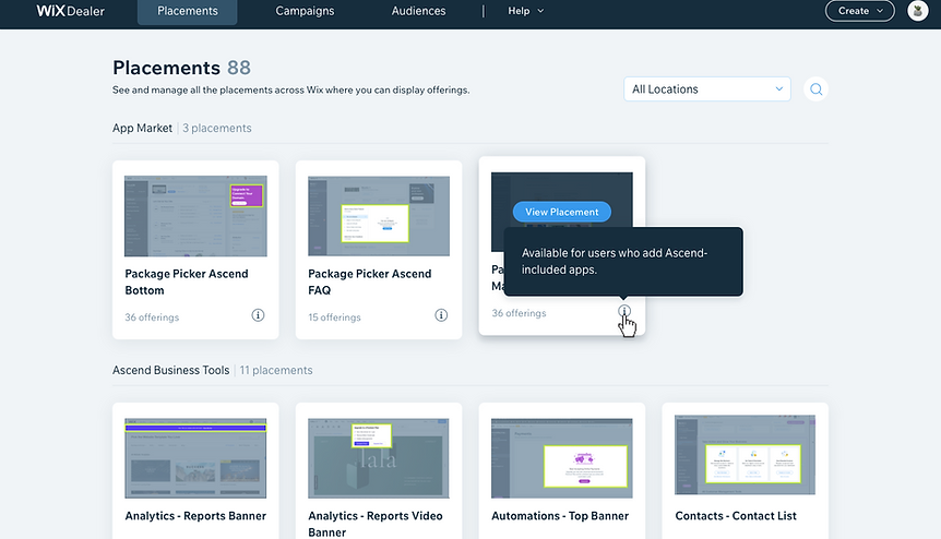
Each placement has its own dedicated page, giving users a focused space to understand and manage it. At the top, users see a brief explanation, key metadata, and a button that opens a side drawer with detailed guidelines and availability rules. This structure helps users quickly get oriented and make informed decisions before creating or assigning offerings.

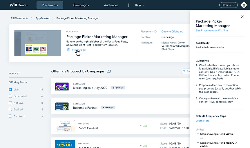
Offerings are grouped under campaigns or shown as stand-alones, giving users a clear sense of structure while supporting different workflows. Each card surfaces just the right amount of information, with expandable views for additional context. Users can preview performance, manage offerings directly, or open a detailed modal to take action — all without navigating away from the main view.


View by - Campaign
The Campaigns view was designed to help users easily scan and manage large volumes of campaigns. Campaigns are grouped by the products they promote and sorted alphabetically to reduce cognitive load. Each card includes key details and a custom visual to help teams recognize and differentiate campaigns quickly - supporting both clarity and future scalability.


Each campaign has its own dedicated page, structured similarly to placement pages for consistency. The top section highlights important actions, key data, and a campaign-level visual for context. Below, all offerings are grouped by the placements in which they appear, with small illustrations marking each type — making it easier for users to understand where and how the campaign is delivered.


View by - Audience
The Audiences view is organized by labels — either user-based or site-based — and visually marked with icons to help users quickly distinguish between audience types. Grouping and sorting the audiences alphabetically ensures easy scanning, while hover interactions reveal additional context about the segments included in each audience.


Each audience has its own dedicated page, designed with a consistent structure but tailored to audience-specific data. Users can choose to view associated offerings grouped by placement or by campaign, depending on what they need to optimize. This flexibility supports both strategic planning and detailed execution.


FIN
What’s Next
With the core redesign in place, we're now focusing on expanding the platform’s capabilities. The upcoming roadmap includes enhancements that improve personalization, targeting precision, creative flexibility, and performance visibility — all aimed at helping teams work smarter and deliver more effective campaigns.
-
Personalized home page
-
Performance indication
-
New targeting screen
-
New creative screen
-
Licenses and registrations