
Insight Manager
B2B DESKTOP APP | BUSINESS INTELLIGENCE
BACKGROUND
APR-JUN 2023 | PRODUCT DESIGNER
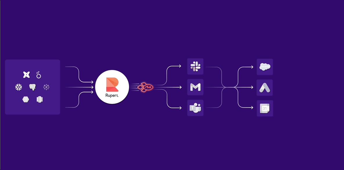
Rupert is a smart analytics distribution platform that turns data insights into action. By connecting BI tools, communication and operational apps (e.g., Slack, Salesforce, Jira), it delivers timely, personalized insight alerts alongside actionable steps - helping teams move from passive dashboards to proactive results .
Redesigned the Insight Manager to help users track, compare, and manage the performance of shared insights - with clearer structure, better visibility, and support for fan-out messages.

CONTEXT
What is an insight?
An Insight is an automated message that delivers digested, actionable data — personalized for an individual or group. It’s one of Rupert’s core features, designed to bring the right information to the right people at the right time.
(Read more about it on Product Hunt)
THE PROBLEM
When legacy structure meets evolving use Cases
The existing table view in the Insight Manager lacked clarity, flexibility, and depth. Users couldn’t easily track performance across different insights, compare variations, or follow engagement at the user level. On top of that, two major product changes had to be addressed in the redesign: a new data-based trigger type, and the growing use of fan-out insights.
From simple triggers to smarter logic
Initially, insights were sent either manually (“send now”) or at scheduled times. The newly introduced data trigger added a third layer: sending insights only when specific metrics met or exceeded defined thresholds. This required a more dynamic interface to represent trigger logic and its outcomes.

Personalized distribution at scale
A fan-out insight allows the same dataset to be distributed to multiple recipients - each with different data needs — in a centralized, efficient way. Instead of creating multiple separate insights, the system generates personalized versions from a single source, tailored to each user’s context.

OLD INSIGHT MANAGER
Why the old Insight Manager no longer worked
The original manager used tabs based on trigger types, but this model broke with the rise of fan-out insights, which could include multiple triggers in one message. Analytics were also aggregated across all sends, making it hard for users to assess individual performance. To understand impact, users needed more context and granularity.


OUR USER - A DATA ANALYST
UX APPROACH
Designing for insight clarity and control
Our research revealed key gaps in how users tracked and evaluated insights. These findings shaped the UX decisions behind the new Insight Manager — focusing on flexibility, visibility, and support for more complex delivery logic.
-
Show delivery-level performance
-
Display clear engagement metrics
-
Enable filtering by creator, trigger type, and fan-out
-
Introduce a dynamic activity log
-
Visualize insight trends over time
-
Remove trigger-based tabs (not compatible with fan-out)
-
Provide full visibility into fan-out insights
KPIS
Success goals
To evaluate the impact of the redesigned Insight Manager, we focused on both usage and outcome-based KPIs:

INFORMATION ARCHITECTURE
From overview to detail
One of the first insights was clear: presenting all information in a single view would overwhelm users and create unnecessary cognitive load. To solve this, I restructured the information architecture around a progressive disclosure model — starting broad and allowing users to drill down for more detail.
The new structure moves from general to specific: a high-level overview of insights, with the ability to explore delivery performance and engagement trends as needed. Fan-out insights introduced an additional layer of complexity, requiring an extra level in the hierarchy to manage and visualize multiple personalized versions of the same message.

THE DESIGN
A scalable, insightful manager
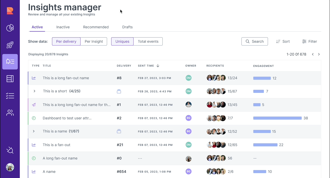
The new view enables users to track each delivery, understand engagement at a glance, and filter insights by creator, trigger, or fan-out logic. Fan-out insights are clearly identified and expandable, solving previous limitations while supporting scale and clarity. At the top, tabs separate insight states (active, draft, etc.), and toggle buttons let users control how data is grouped and measured—by delivery, by insight, or by total events.
To help creators understand what truly drives action, each insight now includes a breakdown of engagement types—visible on hover. This micro-interaction reveals a ranked distribution of actions like clicks, emojis, and report views, giving quick clarity on what resonated most without leaving the page.

Insight overview
Clicking an insight opens a focused view showing all its deliveries. At this level, users can compare engagement and interaction metrics per delivery, helping them identify what worked best and where improvement is needed - all without losing sight of the broader performance.

Users can hover over any metric to reveal detailed insight-level data, including total vs. unique interactions and a breakdown of which users engaged—and how. This adds a new layer of granularity to performance tracking and helps teams better understand user behavior.

This modal provides a read-only preview of the actual message that was sent, offering full visibility into the content, signals, and recommended actions. It helps users recall what was communicated and better interpret the engagement data, without switching back to the message creation flow.

Delivery activity log
Clicking on a specific delivery number opens a detailed activity log, showing every user interaction tied to that message — including reactions, clicks, comments, and unsubscribes. This view enables teams to trace behavior, gather qualitative feedback, and even follow individual user paths to better understand engagement patterns.


Fan-out breakdown view
Clicking on a fan-out row expands the insight, revealing all variants sent within that delivery. This helps users quickly understand how a single insight was tailored to different recipients and how each variant performed.


The fan-out rundown is an additional level of information. Since each fan-out includes multiple personalized variants, this view helps track performance per variant. At the top, users see key metrics like number of variants, deliveries, recipients, reactions, and actions.
The table below shows each variant’s name, ID, delivery time, recipients, any modifications made, and engagement data. It allows teams to quickly compare variants and understand which versions drove better results.


KPIS
Measuring success
Three months after launch, we tracked key usage and engagement metrics to evaluate the impact of the new Insight Manager. The results showed clear improvement in both adoption and performance:
